
Capture
The Challenge
As an aspiring photographer, it can be time-consuming trying to find models to shoot with. As a model, you can be hesitant to shoot with a stranger because you value your safety. Some platforms attempt to simplify this process, but they charge a hefty subscription fee or aren't mobile friendly. Noticing these pain points made me ask: Can I do better and make a safe, quick, and simple collaboration tool for creatives? My process:

App Concept
Capture is a platform for amateur photographers, aspiring models, and businesses. The platform allows people to connect and collaborate in a safe environment. Capture plans to partner with businesses and display casting calls so that models and photographers can build their professional portfolios.
Value Prop
Safe and simple creative collaboration.
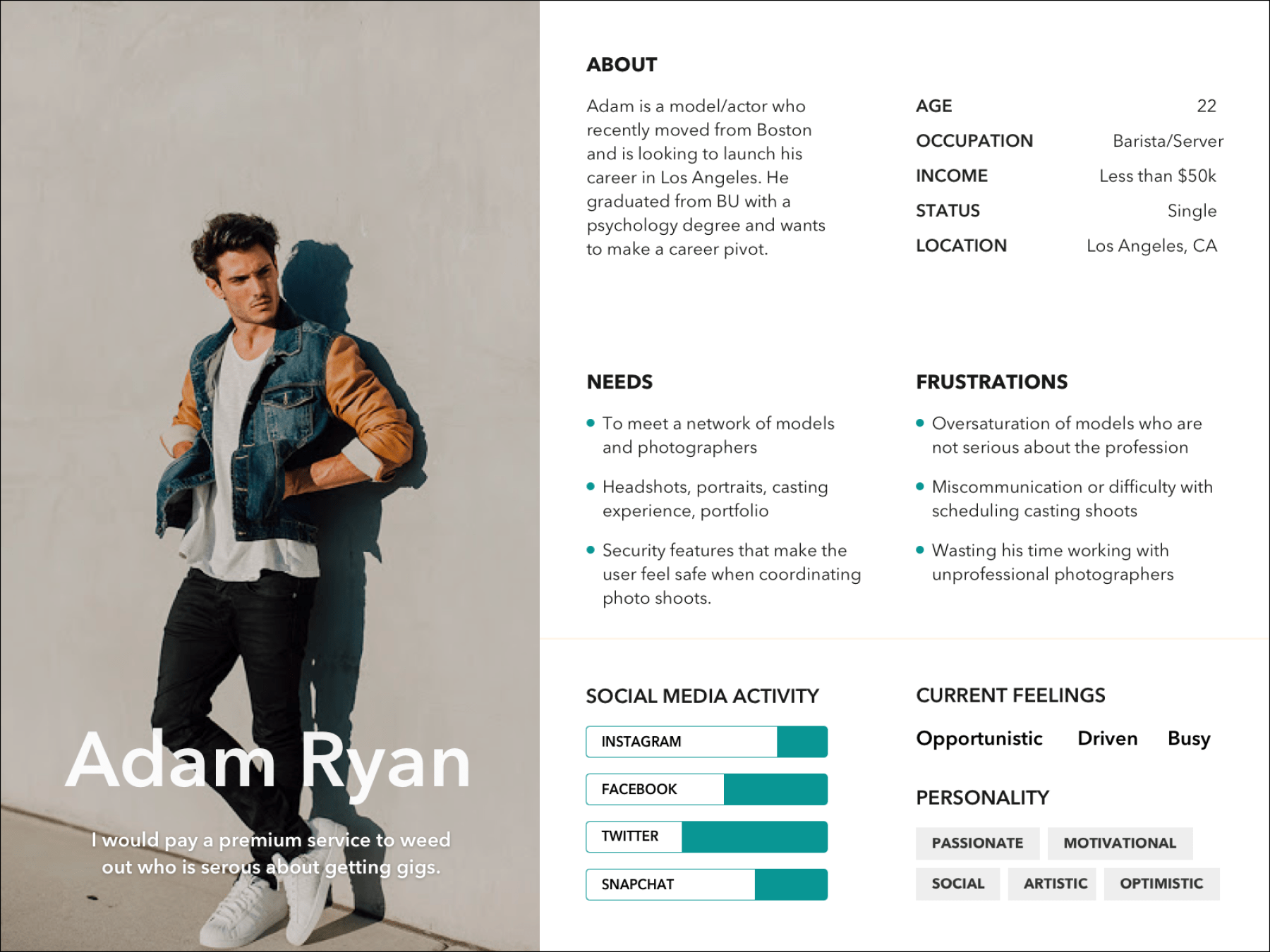
User Persona

Wireframes
Once I created informed personas, I used them as a reference point to design some of Capture's key screens.
Log in: Easy log in that allows users to use Facebook to enter the app.
Select Title: Allows you to select if you are a photographer, model, or business.
Style: Select what type of model, or type of photography you like to shoot.
Intro: An introduction of yourself that would be shown on your profile.
Profile: Shows a top 5 photo selection and your bio.
Filter: Allows you to narrow your search on the home screen.
Profile: Search and find models or photographers to work with.
Contacts: You can add contacts from your own network or people you want to connect within the app.

I shared my screens with potential users and recieved feedback and made the following adjustments.
Select Title: Half the people who reviewed the app didn't like "select title" so I tried "Are you a..." to lead the reader into the options.
Pick Style: I changed the prompt to "What's your style?" to be direct.
Intro: I made sure to add "Bio" in the text box so users knew where this information would be stored.
Filter: My friend who helped design the middle fidelity had done research to be able to fill in the Low-fidelity TBD categories.

Wireframes
I created three separate mood boards to give the app a range of emotions that would help me define the high fidelity design and brand voice. The first one pops out and attempts to balance a fun color with focus and thought. The second features the sunset with a clock to help emphasize the urgency to get out and shoot before the sun goes down. The third is fun, relaxing, and hip. When I completed the mood board designs, I made three quick mockups of the UI, and a/b tested each with models and photographers.


Brand
When the majority of people I asked selected the teal design, I decided that would be the visual style for the application. Knowing the brand color, I developed a logo with the help from a skilled young graphic designer; Remy Maas.

High Fidelity Design V.1
Capture is not out yet. I am not able to share the prototype at the moment but, I will share the marketing poster for photographers that shows off many of the app's features. Capture is in talks of a partnership with ideaction.io in San Fransisco. Together we would revamp my design and do a month of testing before building the revised MVP.

Style Guide
I created a simple style guide for the Capture application and limited the amount of colors so the photo’s would stand out. For the font I wanted a strong and trustworthy font with a bold presence that wasn’t to old feeling. I moved away any sans serif and chose Aviner Next.


Looking Back
When I started this project I quickly noticed many potential revenue streams. My advice to myself and other creatives: Get out and talk to people as soon as you're not sure what a user might think about an idea you have, otherwise you risk creating problems for yourself down the road. I could have saved a lot of time thinking more about the problem and less about the business verticals.
Updated Design
Three months after I finished the first high fidelity design I was approached by an agency that wanted to help me build V2 of the application. I paired with a senior designer and together we came up with what would become version two. V2 has slightly updated functionality, a more personalized style and involved more user testing. The app went on to be pitched to the VC firm Kiwi Tech. Here are a few shots of V2 completed summer of 2019.
